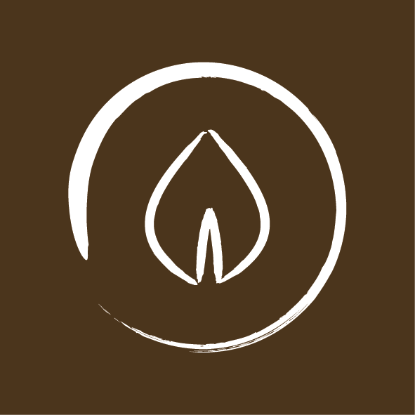
When relaunching our salon & redesigning our logo, we needed imagery that symbolised everything that is important to us here at WAKHT - serving all our clients as individuals, a holistic approach to hair health, a keen awareness of current fashion trends and a focus on the experience of hair styling & design. We worked with UpBound - a small business marketing agency - to gain a clear, indepth understanding of who we are, what we do & what makes us unique. This then guided the development of our brand’s visual components. The resulting logo family was designed to capture WAKHT’s dedication to premium hair care, as well as its belief in providing its customers with a complete in-salon experience.
The primary logo contains parts of the individual logos in repetition, creating the Dreamcatcher icon. This alludes to Native American connections with oursleves & our environment. Clients will see a cohesion with the natural world in WAKHT’s unique approach to salon styling.
The sub logos represent the 5 key elements in nature, and each relate to a part of WAKHT’s vision and approach to customer service:
In Nature (Element): Water
In Practice: Cleansing
In WAKHT: Cleansing the soul to rejuvenate & refresh.
In Nature (Element): Air
In Practice: Knowing how hair moves and using wind to create and style.
In WAKHT: Doing away with the old to create something new.
In Nature (Element): Stone/Metal
In Practice: Tools, craftsmanship
In WAKHT: Returning to your fundamental self & achieving balance.
In Nature (Element): Earth/Wood
In Practice: Growth & nuturing hair through products & services.
In WAKHT: The material from which our skills & talents as hair designers grow.
In Nature (Element): Fire
In Practice: Heat, used in styling.
In WAKHT: Where we belong & what drives our innate passion.